December 11, 2025
United kingdom
Health care

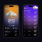
Weather Map is an inclusive mobile app designed to make real-time weather information accessible to everyone in Australia — including users with visual and cognitive impairments. The app focuses on clarity, color accessibility, and intuitive interaction, ensuring weather data is understandable at a glance.
Branding and identity
Websites and digital platforms
Content strategy for social media

To design a simple, visually accessible weather experience that supports users of all abilities, focusing on clarity, localization, and personalization of weather data.
Many existing weather apps overwhelm users with data-heavy interfaces and poor accessibility compliance. The challenge was to design an app that delivers essential information — temperature, forecast, air quality, and alerts — in a clear, inclusive, and localized format for Australian users.
We created a minimal and inclusive design system featuring:


User Research
We began by conducting qualitative research with 10 participants across different regions of Australia, including users with visual impairments and older adults. The goal was to understand how people currently access weather updates and what barriers they face.
Information Architecture
Based on the research, we restructured the app content around three primary use cases: checking current weather, planning the day, and exploring future forecasts.
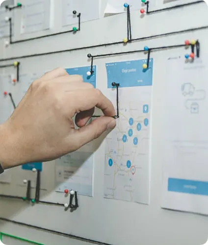
Wireframing & Prototyping
The initial sketches were transformed into low-fidelity wireframes to validate the user flow early. These prototypes focused on accessibility behaviors — how a user with low vision, for instance, could navigate using gestures or how voice descriptions could guide visually impaired users.
UI Design
The visual language took inspiration from Australia’s diverse landscape — coastal blues for clarity, warm desert neutrals for comfort, and soft gradients for smooth visual transitions.
Usability Testing
After designing high-fidelity prototypes, we conducted five rounds of usability tests across multiple devices. Participants used both the visual and voice-assist versions to complete tasks like checking rainfall or enabling dark mode.

The Weather Map app had a significant impact on both usability and accessibility outcomes. After several rounds of design iterations and usability testing, the app achieved a 90% satisfaction rate among test users, with participants describing it as “clear,” “comforting,” and “surprisingly easy to use.”
Compared to the baseline weather app, task completion time improved by over 40%, meaning users were able to check the temperature, forecasts, and alerts much faster with fewer interactions. Visually impaired users, who often struggled with complex navigation in other apps, reported that voice guidance and haptic cues made them feel more confident and independent while using Weather Map.